Be yourself; Everyone else is already taken.
— Oscar Wilde.
This is the first post on my new blog. I’m just getting this new blog going, so stay tuned for more. Subscribe below to get notified when I post new updates.
Be yourself; Everyone else is already taken.
— Oscar Wilde.
This is the first post on my new blog. I’m just getting this new blog going, so stay tuned for more. Subscribe below to get notified when I post new updates.
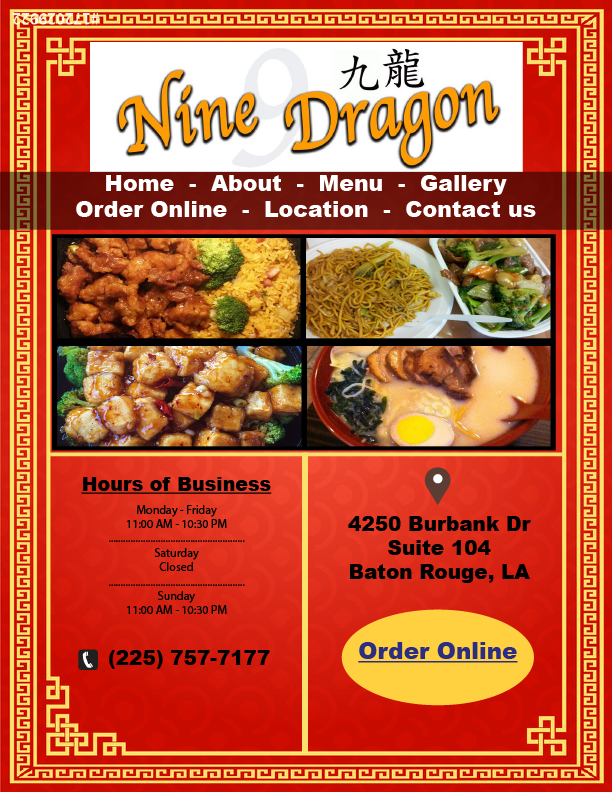
For this assignment, we had to choose one of the bad websites we previously found and redesign the website. I chose the Nine Dragon website. I found that the website was not user friendly and I felt that the information on the site was scattered. Below I have attached the original link to the website, as we’ll as my Illustrator document. Overall, I really enjoyed this assignment and I feel that I have created a much better format for the homepage for Nine Dragon.
https://www.ninedragonchinese.com/#/

I have attached three links below that are bad websites, or websites that I have felt are not user friendly or “all over the place.”
http://www.kingswokbatonrouge.com
The magazine project was challenging and really difficult. However, using the tools we learned in class, the process of collaborating this magazine was much easier than I expected. We were given the assignment to create a cover page and a name for the magazine. I chose to call it “Up Magazine.” I chose this name because it sounds trendy and it is something people would remember. I also had to incorporate an ad of my own creation. i chose to redesign the bad advertisement we did earlier. For this I had to design it in a half page size, and it was much easier than I thought. Being honest, I believe that my redesign looked much better than the previous one. Overall, I enjoyed this assignment because it was challenging and it tested my skills and knowledge in inDesign.
For my bad advertisement assignment, I received an ad for a massage place in Baton Rouge, Louisiana. The ad was mainly red and had a picture of a couple with bathrobes on going into the massage room. What was special about this ad was that it promoted a Valentine’s Day special going on. At first glance, this ad did not seem too bad, but after some analyzation there were a couple things that needed to be fixed. The picture of the couple seemed a little too provocative for the ad, it seemed like the audience was intruding on their privacy. I fixed this by going to the company’s website and uploading picture that featured two massage tables. The font was a little too small, so I fixed it by adding font that was bolder, giving it a more pronounced look. Finally, I fixed the positioning of the valentine’s Day deals. I moved them to the bottom of the page where it would not be covering up the picture. Overall, there were a few things that I had to fix in order to make this advertisement better.
For my assignment on typography, I chose the word “smooth.” I was having trouble thinking of an adjective so I glanced around the room and saw my laptop. I thought about the first word I would use to describe it, and the word “smooth” came to mind. The adjective works well to describe myself because I believe I am level-minded and think smoothly. I first created a text box and typed my word in. I went through the font choices and found the font Skia, which looked exceptional good with my word. I choose this font because of the large, bulky text it creates. In order to really project my adjective, I knew I had to choose a sans serif font. I also decided to bold the text in order to give it a more visually appealing look. I kept the color of the word black in order to give it some definition. However, I had to increase the font size of the word to 89 so it could pop out on the page. Overall, I really enjoyed this assignment and I found it helpful when learning about fonts.
After reviewing my business card with the class, I realized there were a few things that needed to be revised. My name and title on the business card were in a black font color with a red background, which can be hard for an audience to read. In other words, I needed to change my name and title to a different font color that would be easier to read. I chose white as my new font color because it is easier for the audience to read and it makes my name pop out. Another thing I had to revise was how my information was spread out around the business card. In class we discussed how the information needs to be together in order to make the card more readable. I moved all my information to the bottom of the card under my name. I believe that my card is more official after revising where I placed my information. I also decreased the font size of my text in order to fit it on the card. Before the information was somewhat bulky and big. Now the information is at a correct font size that it easy to read. The goal of my final revision was to make the card more appealable. I created two rectangles and moved them in front of my triangles, forming arrows. The purpose of this was to show my audience where my information is, while making the card seem fun. In class we discussed how important it is to have 0.25 inch margins in the case of a printing mishap when information seems to get lost. However, a printing mishap would not be detrimental to the card as the arrow is extended off the card and no information would be lost. Overall, there were several things I had to revise on my business card and I am glad it was taken care of before it was graded.
When Professor Goodwin assigned the business card project I thought it would be nearly impossible. This was my first time working with Adobe InDesign and I could not download the software during class so I had to follow my notes. To my surprise, creating the card was easier than I thought and I enjoyed the process. I put an exceptional amount of thought into the design of my business card. I chose to keep a white background so the audience could focus on the other others with my important information. I decided to implement the colors red and yellow in my design because they are the most “eye catching” colors. The red circle in the middle grabs the attention of the audience and directs their eyes to the most important part of the card, my name. The yellow triangles guide the audience member to other important parts of the card such as my phone number, email address, and home address. I chose to use the Arial Black font for my name because it stands out while it is clear for the reader. My other information is in Arial Rounded MT Bold because it remains clear enough for the audience to read while not being too bulky. Overall, I really enjoyed this project and my debut into using InDesign.
This is an example post, originally published as part of Blogging University. Enroll in one of our ten programs, and start your blog right.
You’re going to publish a post today. Don’t worry about how your blog looks. Don’t worry if you haven’t given it a name yet, or you’re feeling overwhelmed. Just click the “New Post” button, and tell us why you’re here.
Why do this?
The post can be short or long, a personal intro to your life or a bloggy mission statement, a manifesto for the future or a simple outline of your the types of things you hope to publish.
To help you get started, here are a few questions:
You’re not locked into any of this; one of the wonderful things about blogs is how they constantly evolve as we learn, grow, and interact with one another — but it’s good to know where and why you started, and articulating your goals may just give you a few other post ideas.
Can’t think how to get started? Just write the first thing that pops into your head. Anne Lamott, author of a book on writing we love, says that you need to give yourself permission to write a “crappy first draft”. Anne makes a great point — just start writing, and worry about editing it later.
When you’re ready to publish, give your post three to five tags that describe your blog’s focus — writing, photography, fiction, parenting, food, cars, movies, sports, whatever. These tags will help others who care about your topics find you in the Reader. Make sure one of the tags is “zerotohero,” so other new bloggers can find you, too.
